When it comes to web design, many business owners want to design their own website or Do-It-Yourselfers. We want to help them design the best website possible. When your business succeeds, so do we. When you are creating a website (or hiring a web designer), there are many details to keep in mind. For most, the first instinct is to just build something quick and easy so you can be found on the Internet. Yes, but there is so much more to consider. If you take a few moments up front, you can save yourself many headaches later! We love to help steer our clients in the right direction concerning their presence on the Internet, so we would like to share five web design tips that might help you.
Layout

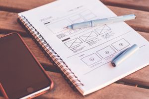
Keep it simple. The best idea is to take a few moments and think about what you want your website to look like and how you want it to function. What colors do you want to use? We usually use 3-4 colors that are complementary. You might check out these resources for color choices: Canva and ColorCombos.com. What fonts do you like? Are they appealing to your audience? You might be surprised how many choices are available. Here’s a blog post that might be helpful: Typography. Develop a flowchart of the pages and how you want them to interact. Start with the Home page, About page, Sales/Services page, and Contact page, then add pages as necessary. Remember at most of your users are on a mobile device. Keep the most important items at the top and on the Home page. Don’t make your users click around too much, you will lose them. Don’t use too much clutter, it will distract your visitors. Use sidebars sparingly. If you use popups, keep it to a few pages. Keep your site organized and professional. Make sure it is easy to navigate for your users. Can they get to the information or items they want without out clicking around too much? Remember your audience may be different than you or broader than you think. Just because you think it is simple does not mean your users will agree. Always keep your users in mind when designing a website.
Content

Keep your content relevant to what your users are looking to find. If they are looking for a phone number, make sure they can click and call. If they are looking for an address, make sure they can also get directions with a click. Making the most important items really easy to find will help your users be more satisfied and come back! Most people will not spend more than a minute or less trying to figure out if what you have to offer is what they need before they click off to another site. Extra fun facts and photos may help make your site fun or interesting, but content is what will drive them to purchase. Make sure the extra items are extra and don’t take up valuable space.
Images

A picture is worth a thousand words, right? Nothing is more true on a website. With one photo, you can convey all your company is about. High-resolution photos can help but watch the file size. You don’t want it to slow down your load time. If you don’t have access to all the photos you need, there are plenty of FREE commercial use sites to choose photos such as Pixaby.com. You can also make great sliders with this free tool: Canva.com
Call To Action

Causing some type of action is the real reason you have a website, right? Don’t forget to tell the visitors exactly what you want them to do. Make an appointment, call for a quote, buy a product or service, or sign up for a mailing list. Make it apparent and easy to find. Colorful buttons or buttons that contain photos can help. Create your own using any online tool. Using other’s designs may infringe on copyright, so it’s always best to create your own graphics.
Optimization

Optimizing your website is a necessary element in its success. Search engines read the code behind the pages and elements that are seen. But, don’t be afraid, even a novice can optimize a website. Pay attention to the name of different elements like images, photos and buttons. Name them appropriately and include references to your company name or products when it makes sense. Make sure to fill in the alt-tags when adding an image. Again, be smart. Your tags need to be relevant, but specific to your business. The best optimization tool is free, update your website frequently. By putting fresh content on your website, it gives search engines a reason to come back often. The more relevant information they can decipher for your users, the better optimized your site will be.
With many web design options to choose from the possibilities are endless. For the Do-It-Yourself types, it’s an exciting and interesting journey to build a basic site all by yourself. After you build your site, we suggest giving us a call to schedule a FREE website review. We’ll give you helpful, specific tips to get your web design right where you want it.

