Colors … of the rainbow? What does that have to do with web design? Well, believe it or not, many of us base our feelings, decisions and even purchases based on colors. Marketing representatives of huge companies know this. They spend countless hours branding items with certain colors to make you feel a certain way about their product or to make you more aware of their product versus a competitor.
For instance, how do you feel about Lowe’s or Home Depot? Which brand do your prefer? It might be that Lowe’s chose blue to make you feel secure, loyal and trustworthy, while Home Depot chose orange to make you think construction, confidence, and friendly. Two different brands, two different colors, two different meanings.


Which picture is your eye drawn to and why?
When you look at your website, what kind of feeling do you portray? I know, strange question. But, you are telling your users something without saying a word. Choose carefully.
Now that I’ve scared you into thinking, oh, no, what have I done? Let me also say that most people all ready know what colors they like and don’t like and for the most part, this plays into your website design. It’s definitely something to think about, but don’t over think it. Keep it simple. If you like a color, use it. If you don’t, then don’t. Part of what you are doing is letting your audience know who you are and what you offer. Color is a part of that.
Here is a couple of links that might be helpful for those of us who just don’t know what colors go together.
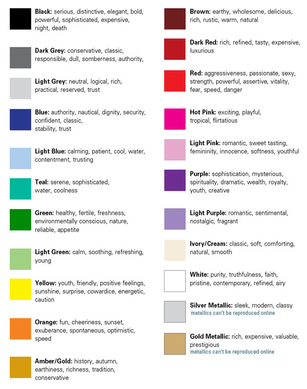
I’ve also attached a color meaning chart I created to help you understand the color meaning both positive and negative. Again, this is just another consideration when looking at your website. Remember, keep it simple!
I wish you the best in your endeavor!


