
Web Design is an art of its own. As website developers, we are always researching and learning more about actual design techniques. Looking at the artwork we use and putting some thought into the “psychology” behind using it. Trying to understand how people think and react to design elements is important and can help your web presence be more successful.
Many site builders take the guesswork out of how to layout and build a website. They even provide graphics and colors, but the actual “science” or “art” of creating a website that draws users and helps your business grow may take a little training and thought. These basic principles are helpful to know how your users will process information and how to layout your website information so your users can find what they are looking for is important.
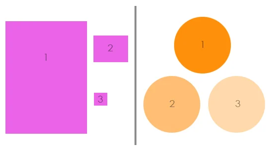
Balance
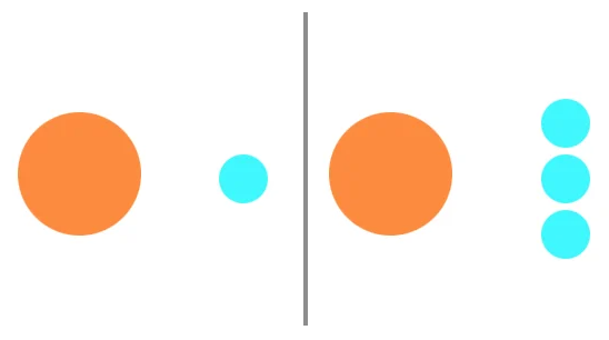
LEFT: The balance is shifted to the left.
RIGHT: The balance is more even.
A balanced layout seems right. It gives a sense of stability and is aesthetically pleasing without us even knowing it. There may be some areas that are focal points on purpose, but one area doesn’t over power another. It gives an easy flow to the path of conversion without being disruptive.
Repetition
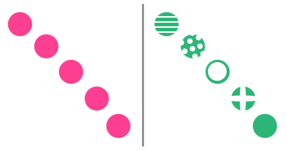
LEFT: The eye is lead quickly from one corner to the other.
RIGHT: Though using the same shapes, more time is needed to absorb the new information within each one.
Repetition of graphical content brings a clear sense of direction and consistency to a websites. It helps organize information and guide your users by bringing everything together in a cohesive manner. It can teach your users the best way to interact with your site and help them know what to expect.
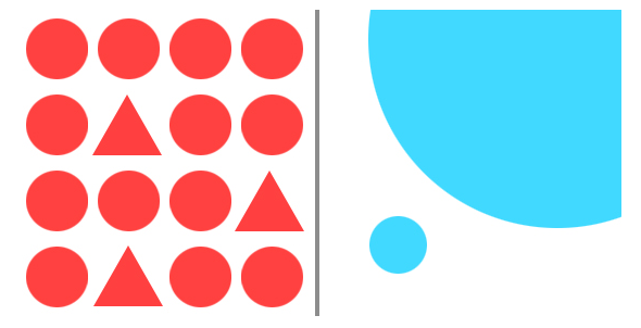
Contrast

COMPARISON OF 3 SHAPES: The dark shapes contrast the light background. The round-edged circle contrasts the sharp-edged triangle. The small triangle contrasts the large circles. The two clear shapes contrast the blurred shape.
Contrast is the relationship between two or more design elements. Their dramatic differences are emphasized when these elements are shown together. Contrast in design elements on a website can be in the size, shape, color, sharpness, space, and more. The degree of contrast between elements is used to create a focal point and establish visual interest.
Dominance
LEFT: Dominance of shape avoids monotony.
RIGHT: Dominance of size creates interest.
Dominance is creating an element with more visual weight. It draws the users to a certain area or point. By giving one element noticeable more visual weight than another, it makes it easier for your viewers to find the starting point. Dominance can be used in size, color, shape, depth, density, texture and more.
Hierarchy
LEFT: Hierarchy in order of size.
RIGHT: Hierarchy from Darkest to lightest.
Hierarchy implies importance to the elements on your website. By changing their size or color, you can subtly rank design elements to influence the order you want your users to view them.
These principles can sometimes be overwhelming, so let’s take a look at a practical example:
Balance is shown in a little different manner here. Although the graphic on the far left is larger than the other elements, the text in the middle is slanted in order to lend more weight to the right.
Repetition is used by showing two of the same images, but also the individual pyramid shapes within the images.
Dominance is noted in the size of the two images with flowers and pyramids being colored differently so as to avoid monotony.
Contrast of the images and the text are noticed from the lightly colored background, and therefore pop-out in the space.
Hierarchy is established by the flower on the left being larger and shows the user where to start, their eye is drawn from the larger flower on the left to the smaller flower on the right, stopping to view the headlining test in the middle. Again, hierarchy is shown at the top and in the largest font, next is smaller font and then separation for more details.
Designing a website is more than just creating content. It takes time to think of how you want to draw your users attention and how you want to lead them to action. These are just a start in thinking like a web designer and how visual content makes a difference.